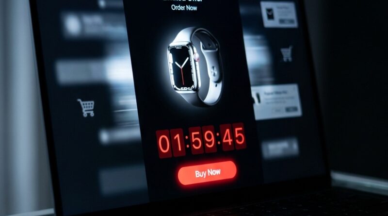
The ‘One-Window Flash’ Strategy: Turn A Standalone Deal Page Into A 24‑Hour Conversion Magnet
You can feel the problem almost immediately. You set up a flash sale, cut the price, send the emails, maybe even pay for a burst of traffic, and then shoppers land on a page that looks like every other page in your store. There are menus, popups, side offers, unrelated products, and a banner shouting about something else entirely. No wonder people drift. A flash sale is supposed to feel urgent and obvious, not like a scavenger hunt. That is where a smart ecommerce flash sale landing page strategy changes the game. Instead of dropping visitors into a crowded storefront, you give them one clean window with one job. See the deal, trust the deal, buy the deal. Done right, this kind of standalone page can convert better, lift cart value with a few well-placed add-ons, and even earn extra traffic from deal sites, search engines, and AI shopping tools that prefer a single clear offer page.
⚡ In a Hurry? Key Takeaways
- A standalone flash sale page usually converts better than sending traffic to a busy storefront or collection page.
- Start with one focused page that shows the discount, countdown, inventory, shipping terms, and a clear buy button above the fold.
- Keep it honest. Fake scarcity, broken timers, and slow mobile pages can hurt trust faster than any discount can fix.
Why most flash sales underperform
Many merchants think the sale itself is the strategy. It is not. The discount is only the hook. The page experience does the heavy lifting.
If a shopper clicks a sale ad and lands in a store with 200 products, they have to work too hard. They start comparing. They get distracted. They lose the thread. Every extra choice lowers urgency.
That is why a strong ecommerce flash sale landing page strategy matters right now. Platforms and shoppers both reward pages that are fast, focused, and easy to understand in seconds.
What the “One-Window Flash” strategy actually means
Think of it like a shop window on a busy street. You are not trying to show everything you sell. You are showing the one deal that makes someone stop walking.
A One-Window Flash page is a standalone page built for a single sale event, usually lasting 24 hours or less. It has one main offer, one clear call to action, and only a few supporting elements that help close the sale.
This idea pairs nicely with The ‘One-SKU Flash’ Strategy: Turn A Single Hero Product Into Your Highest‑Margin 24‑Hour Sale. If your product mix is getting too messy, starting with one hero item can make the page even stronger.
The blueprint for a high-converting standalone deal page
1. Put the offer above the fold
A visitor should know three things without scrolling. What the product is, how much they save, and when the deal ends.
Good example: “24-Hour Flash Sale. Wireless Earbuds. Today only, $49 instead of $89.”
Bad example: a pretty lifestyle image with a vague “summer savings” headline.
2. Use a real countdown timer
A timer works when it is tied to a real end time. It helps people make a decision now instead of later.
Keep it simple. Show hours and minutes. Make sure it works on mobile. And once the timer ends, let the page expire or change state. A timer that resets every day without explanation trains shoppers not to believe you.
3. Show live or near-live inventory
Scarcity is powerful when it is real. If stock is moving, say so clearly. “Only 18 left” or “87 claimed today” can push action.
Just do not make it cheesy. Fake inventory counters are easy to spot, and they damage trust.
4. Strip away distractions
This is the hardest part for many store owners. Your normal site navigation feels important because you spent time building it.
But for a flash sale page, less is usually more. Remove the homepage carousel. Hide unrelated product grids. Tone down popups. If possible, cut the top navigation to the bare minimum.
The goal is not to show your whole business. The goal is to help someone buy the deal they clicked for.
5. Add only smart add-ons
You do not need a giant upsell funnel. One or two sensible add-ons can lift average order value without cluttering the page.
If you are selling a coffee maker, the add-on might be filters or beans. If you are selling a beauty device, the add-on could be replacement heads or a travel case.
Keep these add-ons close to the add-to-cart button or inside the cart drawer. They should feel helpful, not sneaky.
6. Answer the trust questions fast
People hesitate for predictable reasons. Shipping. Returns. Warranty. Payment options. Delivery timing.
Do not bury those details in the footer. Put short trust signals near the buying area. Think “Free shipping over $50,” “30-day returns,” or “Secure checkout.”
7. Make the page easy to index and share
This part gets overlooked. A standalone page is not just better for conversions. It is easier to share in newsletters, deal communities, social posts, and AI-powered shopping searches.
Give the page a clear title, plain-language URL, and a clean meta description. Use product schema if your platform supports it. Make sure the main image is sharp and the pricing is machine-readable.
Where the extra traffic can come from
Once your page is a self-contained offer, it becomes much easier to promote outside your store. That can mean public deal feeds, coupon communities, affiliate partners, and shopping discovery tools.
It can also help with AI shopping assistants and “best deals” search experiences, because these tools prefer pages that clearly state the product, price, discount, availability, and timing.
In plain English, a messy collection page is hard for both humans and machines to understand. A focused sale page is easier for both.
How to build one without a huge redesign
You do not need to rebuild your whole site. Most merchants can do this with a landing page template, a duplicate product template, or a page builder inside Shopify, WooCommerce, or a similar platform.
Start with this simple layout
Top section: product image, headline, sale price, original price, timer, buy button.
Middle section: key benefits, social proof, inventory status, shipping and return details.
Lower section: one or two add-ons, short FAQ, final call to action.
That is enough for many 24-hour promotions.
Keep mobile front and center
A lot of flash sale traffic comes from phones. If the timer overlaps the buy button, if the images load slowly, or if the sticky add-to-cart bar covers key information, conversions drop fast.
Always test the page on your own phone before launch. Then test it again on a slower connection.
Common mistakes that quietly kill conversions
Sending paid traffic to the homepage
This is the classic own goal. If your ad talks about one deal, the landing page should match that exact deal.
Running multiple messages at once
If the page says “24-hour flash sale” but the sitewide header says “weekend clearance” and a popup says “join for 10% off,” the shopper gets mixed signals.
Forgetting page speed
Urgency does not matter if the page takes five seconds to load. Compress images. Cut heavy scripts. Remove anything nonessential for the event.
Hiding the fine print
If a deal has exclusions, say so. If shipping takes longer than usual, say so. Honest friction is better than buyer’s remorse.
What success looks like
The good version of a flash sale feels almost boring in the best possible way. The shopper clicks. The page loads quickly. The product and savings are obvious. The timer feels real. The buying path is short. The extras make sense.
That kind of page does not just convert better. It also gives you cleaner data. You can see the performance of one offer, one traffic source, one page structure. That makes your next sale easier to improve.
At a Glance: Comparison
| Feature/Aspect | Details | Verdict |
|---|---|---|
| Homepage or collection page | Shows many products, mixed messages, more clicks needed before checkout | Fine for browsing, weak for urgent flash-sale traffic |
| Standalone flash sale page | Single clear offer, countdown, inventory, trust signals, direct path to purchase | Best choice for focused conversions and cleaner promotion |
| External discoverability | Dedicated deal URLs are easier for deal sites, search engines, and AI shopping tools to parse and share | Strong bonus value beyond your existing ad spend |
Conclusion
Here is the big takeaway. Toggling a discount in Shopify or TikTok Shop is not a flash sale strategy. It is just a price change. The merchants winning more from 24-hour promos are building clean, self-contained pages that load fast, show a real countdown, expose live inventory, and stand on their own as a shareable deal. That is what makes an ecommerce flash sale landing page strategy worth your time. You can raise conversion by removing clutter, lift average order value with a couple of smart add-ons, and pick up extra traffic from public deal feeds and AI-powered shopping searches, all without increasing your ad budget. Start small if you need to. One page. One offer. One clear path to buy. Often, that is all a flash sale needed in the first place.