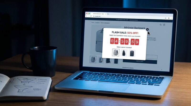
The ‘One-Touch Pop‑Up Flash’ Strategy: Turn A Single On‑Site Prompt Into Your Highest‑Converting Sale Of The Week
You know the feeling. You spend days planning a flash sale, line up the email, maybe pay for ads, then watch visitors hit your site and leave before the offer even gets a chance. That hurts more in 2026, when every click costs more and tracking what worked is messier than ever. The good news is you do not always need a full campaign. A smart ecommerce flash sale popup strategy can turn one high-intent moment into your best sale of the week. Not a site-wide discount. Not a popup blasted at everyone the second they land. One well-timed prompt. One narrow offer. One short countdown. If somebody views the same product twice, builds a cart past a certain amount, or stalls at checkout, that is your opening. Done right, this kind of popup feels less like a billboard and more like a timely nudge. It can rescue revenue you were about to lose anyway, without training customers to wait for discounts.
⚡ In a Hurry? Key Takeaways
- Use a flash-style popup only for high-intent visitors, not every visitor.
- Start with one trigger, one product set, and a short countdown so you can test it in an afternoon.
- Keep the offer narrow to protect margins and avoid training full-price shoppers to wait for discounts.
Why most pop-ups fail
Most pop-ups are either too early, too broad, or too boring.
The classic email signup box that appears five seconds after page load is easy to ignore. A generic 10% off offer shown to everyone is not much better. It cuts into margin, annoys people who were ready to buy anyway, and often does nothing for visitors who are still unsure.
The better approach is simple. Stop thinking of your popup as a site decoration. Start treating it like a last-minute sales rep who steps in only when someone shows real buying signals.
What the one-touch pop-up strategy actually is
This strategy is a targeted, flash-style offer shown on-site when a shopper crosses a clear intent threshold.
That threshold could be:
- Viewing the same product twice in one session
- Spending a certain amount of time on a product page
- Reaching a cart value like $75 or $100
- Starting checkout, then pausing
- Showing exit intent from cart or checkout
Instead of running a full-store sale, you show one narrow offer with a short clock. Think 15 minutes. Maybe one hour. The popup appears once, at the moment the customer is most likely to leave or hesitate.
That is why this ecommerce flash sale popup strategy works. It catches the sale while intent is high, but before the shopper disappears.
Why this works better than a broad flash sale
You are not discounting the whole store
A site-wide flash sale can create noise, but it also trains people to wait. A targeted popup keeps the discount hidden from shoppers who do not need it.
You do not need extra traffic
This is the big one. You are using traffic you already paid for. No new ad set. No extra email blast. No new landing page if you want to move fast.
It feels more relevant
If someone is clearly interested in one item or one cart range, a popup tied to that behavior makes sense. It does not feel random.
If you do want to tighten the path after the click, pairing this with a focused page can work well. That is where The ‘Micro-Landing Flash Sale’ Strategy: Turn One Product Page Into a Conversion War Room fits nicely. The popup catches the moment, and the page keeps the shopper from wandering off.
How to build it without overcomplicating things
1. Pick one trigger
Do not start with six rules and a spreadsheet full of segments. Pick the cleanest buying signal you already have access to.
Good first tests:
- Viewed same product twice
- Cart value above a set amount
- Checkout idle for 30 to 60 seconds
If your pop-up tool supports behavior-based triggers, great. If not, start with the simplest event your platform can detect.
2. Keep the offer narrow
This is where a lot of stores go wrong. They panic and throw 15% off the whole cart at everybody.
Try one of these instead:
- 10% off one product category
- $15 off carts over $100
- Free shipping for a tight cart range
- A small bonus item tied to one collection
Narrow beats broad. It protects your margin and makes the message easier to understand.
3. Add a real deadline
A flash popup without urgency is just a coupon box.
Use a short countdown that matches the shopper’s moment. Fifteen minutes is often enough for cart recovery. One hour can work for product hesitation. Keep it honest. If the timer resets forever, shoppers figure that out quickly.
4. Write copy like a human
Skip the hype. Say what the shopper gets, what qualifies, and when it ends.
For example:
- Still thinking it over? Take 10% off this item for the next 15 minutes.
- Your cart qualifies. Finish checkout in the next 20 minutes and get free shipping.
- Before you go. Spend $100 today and save $15. Offer ends when this timer hits zero.
Short. Clear. Specific.
5. Show it once
If someone closes it, back off. Repeating the popup every page view turns a helpful nudge into a mosquito.
Best places to trigger the popup
Product page hesitation
If somebody comes back to the same product or lingers a long time, they are interested but stuck. A small, short-lived offer can push them over the line.
Cart threshold reached
This one is especially useful for boosting average order value. If the cart hits $90, a popup offering a reward at $100 can work better than a blanket discount.
Checkout stall
Checkout is where friction gets expensive. A shopper who pauses here is not casual traffic. They are close. This is one of the strongest spots for a one-touch flash prompt.
Exit intent from key pages
Exit intent can still work, but only on product, cart, or checkout pages. Showing an exit popup on every page of your site is how you end up annoying people who were never close to buying.
What to avoid
- Showing the popup immediately after page load
- Offering the same discount to every visitor
- Using fake countdown timers that reset endlessly
- Making the popup hard to close on mobile
- Testing too many variables at once
The goal is not to make a louder popup. The goal is to make a smarter one.
How to measure whether it is working
You do not need a fancy analytics setup to get a useful answer.
Track these basics:
- Popup view rate
- Click or claim rate
- Conversion rate after seeing the popup
- Average order value for popup conversions
- Total recovered revenue
Also compare it against what those shoppers would have done without the offer. If your popup is mostly discounting people who were already going to buy, tighten the trigger or reduce the offer.
A simple first test to run this week
If you want the easiest version, do this:
- Choose one product category with healthy margin.
- Set a popup to trigger only when a shopper views the same product twice.
- Offer 10% off that category for 15 minutes.
- Show it once per session.
- Run it for five to seven days and review results.
That is enough to tell you if your store responds well to behavior-based flash prompts.
At a Glance: Comparison
| Feature/Aspect | Details | Verdict |
|---|---|---|
| Audience targeting | Only high-intent shoppers see the flash offer, based on behavior like repeat views, cart value, or checkout stalling. | Best for protecting margins and improving relevance. |
| Offer structure | Short countdown, narrow product set or cart range, and one clear incentive. | Stronger than a generic storewide 10% off popup. |
| Setup effort | Can usually be tested with existing popup tools in a single afternoon, without a new funnel or major dev work. | Low effort, high upside for smaller brands. |
Conclusion
If your current pop-ups are annoying people or getting ignored, the answer is not to give up on them. It is to get more precise. On-site prompts are still one of the strongest conversion surfaces in ecommerce, but they only shine when they are tied to intent. In 2026, traffic is expensive, attribution is messy, and attention is split across too many channels. A tightly targeted flash-style popup gives smaller brands a practical way to claw back lost revenue without building new funnels, hiring agencies, or waiting on dev. Start small. Set one trigger, use a real countdown, and limit the offer to a narrow product set or cart range. Done right, that one on-site prompt can do the work of a much bigger campaign, while full-price buyers never even see it.