The ‘Micro-Landing Flash Sale’ Strategy: Turn One Product Page Into a Conversion War Room
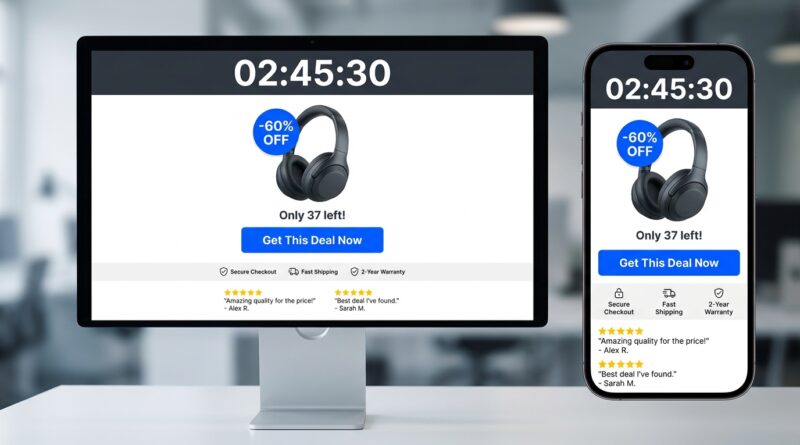
You can feel the money leaking out when a flash sale ad works, people click, and then land on a busy homepage with ten banners, six menus and no clear path to the deal. It is frustrating because the traffic part was the hard part. You paid for the click. You earned the attention. Then your own store got in the way. A better fix is simpler than it sounds. Instead of sending shoppers into your whole site, build one focused page for the one offer you want them to buy right now. That is the heart of a smart flash sale landing page strategy. Duplicate your existing product page, strip out anything that distracts, put the timer, price drop, stock count and buy button front and center, and send every email, ad, text and social post to that page. Think of it as turning one product page into a mini sales floor with one cashier, one sign and one job, convert fast.
⚡ In a Hurry? Key Takeaways
- A focused micro-landing page usually converts better than sending flash sale traffic to a homepage or general collection.
- Start by cloning one product page, then remove menus, extra links and unrelated products, and add a countdown, stock counter and clear call to action.
- Keep urgency honest. Fake timers and fake stock numbers can hurt trust and tank repeat sales.
Why most flash sales stumble
Here is the usual pattern. A brand gets excited about a limited-time offer, spins up some ads, posts on Instagram, maybe sends an email blast, then links everything to the homepage or a category page.
That sounds reasonable until you look at it on a phone. The shopper lands, pinches to zoom, scrolls past unrelated products, gets distracted by the main navigation, then leaves. The offer may still be good, but the path is messy.
A flash sale landing page strategy fixes that by cutting choices, not adding more. That matters because flash sales are not browsing events. They are decision events.
What a micro-landing page really is
A micro-landing page is not some fancy rebuild. It is usually just a focused version of a page you already have.
In plain English, you take an existing product page and turn it into a temporary sales page built around one offer. One product. One deadline. One call to action.
What stays on the page
Keep the essentials:
- The product name and hero image
- The sale price and savings
- A short, sharp value message
- The countdown timer
- A stock counter or units-left message
- The buy button
- Key trust signals like reviews, shipping info and returns
What goes off the page
Remove or hide the stuff that steals attention:
- Big navigation menus
- Homepage banners
- Links to unrelated collections
- Recommended products
- Long brand stories above the buy button
- Popups that interrupt checkout intent
The goal is not to make the page empty. The goal is to make the next step obvious.
The conversion war room idea
I like the phrase “conversion war room” because it helps you think clearly. Every part of the page should answer one of three questions fast.
- What is the deal?
- Why should I care right now?
- How do I buy it in the next 10 seconds?
If a page element does not help answer one of those questions, it probably does not belong on your flash page.
How to build one without a big dev project
This is the part smaller brands often miss. You do not need a whole custom build to test this.
Step 1: Duplicate your best-performing product page
Pick a product page that already sells well. Clone it. That gives you a working base with images, pricing blocks and checkout hooks already in place.
Step 2: Rewrite the top section for urgency
Your first screen on mobile should show the product, discount, timer and buy button with as little scrolling as possible.
Good examples:
- “Flash Sale. 40% off until 9 PM.”
- “Ends tonight. Only 27 left at this price.”
- “One-day drop. Free shipping included.”
Step 3: Trim distractions
This is where the real gains usually come from. Hide header links if your platform allows it. Move long descriptions lower. Cut side trips.
Step 4: Add urgency tools carefully
Use a real countdown tied to the actual end time. Use a stock counter tied to real inventory if possible. If stock changes slowly, “Low stock” messaging can work too, but be honest.
Step 5: Make the buy path friction-free
Offer the fewest choices necessary. If there are too many sizes, bundles or variants, the sale can stall. Preselect the most common option when appropriate, and keep checkout as short as possible.
What matters most on mobile
Most shoppers will first see your offer on a phone. That changes the rules.
Desktop pages can get away with more clutter because there is room. Mobile cannot. If your page makes someone scroll through fluff before they can even confirm the discount, you are already losing them.
Mobile checklist
- Headline and discount visible immediately
- Buy button above the fold if possible
- Sticky add-to-cart button for longer pages
- Compressed images so the page loads fast
- Timer and stock message readable without zooming
- Payment options clearly shown
If you want extra traffic from people who already know you, pair this page with a direct-notification plan like The ‘App Push Flash Sale’ Strategy: Turn Your Most Loyal Shoppers Into Free Traffic On Tap. It is a smart match. Push the alert, then send every tap to the same focused page.
The trust problem, and how not to blow it
Urgency works. Fake urgency backfires.
Shoppers are not naive. If your timer resets tomorrow, or your “Only 3 left” message appears every week, people notice. You might get one sale, but you lose the next five.
Use urgency that can be defended
- Real end times
- Real inventory limits
- Clear shipping cutoffs
- Specific promo terms
That keeps the page persuasive without feeling shady.
What to measure after launch
You do not need a data science team. Just watch a few useful numbers.
- Landing page conversion rate
- Add-to-cart rate
- Bounce rate
- Average order value
- Revenue per visitor
- Mobile vs desktop conversion
If conversion improves but order value drops, test a simple bundle below the main offer. If bounce rate is high, your page may still be too busy or too slow.
Common mistakes that quietly kill flash sales
Sending traffic to too many places
Every promo source should point to the same page unless there is a very good reason not to. Fragmented traffic makes testing harder and shopping slower.
Explaining too much before selling
Your brand story matters. Your production process matters. During a flash sale, they matter after the shopper understands the offer.
Forgetting post-click consistency
If your ad says “50% off today only,” the page must repeat that instantly. No hunting. No mixed message.
Making people dig for shipping info
One of the fastest ways to lose a sale is uncertainty. Put shipping cost, delivery estimate and return basics near the buy section.
Who should use this strategy
Pretty much any smaller ecommerce brand running short promotions can use it, especially if paid traffic is involved.
It is particularly useful for:
- Single hero products
- Seasonal clear-outs
- Limited color drops
- Bundle offers
- Apparel and beauty launches with one clear featured item
If you sell a huge catalog, that is fine too. Just resist the urge to feature everything at once. A flash sale landing page strategy works because it narrows the decision.
At a Glance: Comparison
| Feature/Aspect | Details | Verdict |
|---|---|---|
| Traffic destination | Homepage or collection pages create more choices and more drop-off. A micro-landing page gives one focused route to purchase. | Micro-landing page wins for flash sales. |
| Setup effort | Usually low if you duplicate an existing product page and edit the layout, copy and urgency blocks. | High impact without a huge build. |
| Customer trust | Real timers, honest stock counts and clear shipping details increase confidence. Fake scarcity hurts repeat business. | Use urgency, but keep it truthful. |
Conclusion
Flash sales do not usually fail because the offer was weak. They fail because the path was messy. Today’s traffic is too expensive and attention spans are too short for sloppy flash sale funnels. A focused micro-landing approach lets smaller brands compete with big-box stores by squeezing the maximum revenue out of every visit, especially on mobile where most shoppers now first see your offer. The good news is that this is not a giant rebuild. It is a practical, low-dev shift you can roll out for your very next campaign. Duplicate an existing product page, remove every distraction that does not help someone say yes to this one deal, add a countdown and real-time stock counter, then drive all paid and organic promo into that single, high-converting experience. Clean page. Clear offer. Better odds.