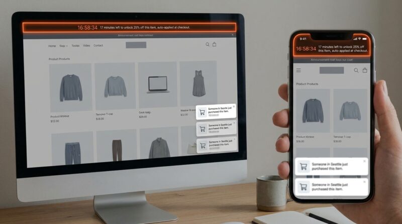
The ‘Surprise Strip-Flash’ Strategy: Turn One Floating Bar Into Your Highest-Converting Sale Of The Week
You can feel the trap. Run another big sitewide promo, and your margins take a hit. Skip it, and that floating bar at the top of your store keeps doing almost nothing. Worse, shoppers have seen every fake countdown clock and “going fast” message in the book. They know the tricks now. That is why the smarter move is not a louder sale. It is a smaller one, shown only to people already close to buying. A good floating announcement bar flash sale strategy turns that thin strip of pixels into a timely nudge instead of background wallpaper. The idea is simple. Show a real, short offer to high-intent visitors only. Think “17 minutes left on this product” or “6 units left in your size,” then remove it the second the window closes. No site redesign. No training your whole customer base to wait for coupons. Just one targeted bar, switched on at the right moment, to move product without cheapening your brand.
⚡ In a Hurry? Key Takeaways
- Use one floating bar for short, real flash offers aimed only at high-intent visitors, not everyone on your site.
- Start with simple rules like product-page views, cart value, or repeat visits, then show a 10 to 20 minute offer or low-stock message.
- Keep every claim true and auto-expire the bar when time or stock runs out, so you protect trust while still creating urgency.
Why the old urgency playbook stopped working
Customers are not naive. If every page has a countdown timer, every item is “almost gone,” and every weekend brings a “today only” code, people stop reacting. Some ignore it. Some stop trusting the brand entirely.
That is the big shift in 2026. Urgency still works, but only when it feels earned. A generic sitewide banner that screams 20% off everything is easy to tune out. A well-timed message on a product someone has viewed twice in 24 hours feels different. It feels relevant.
That is what makes a floating announcement bar flash sale strategy worth testing. You are not blasting a discount. You are placing a small, believable offer in front of someone who already has buying intent.
What the “Surprise Strip-Flash” strategy actually is
It is one floating bar, usually at the top or bottom of the page, that appears only when certain conditions are met.
The core idea
Instead of showing the same banner to every visitor, you create a rule-based trigger. When a shopper shows signs they are close to buying, the bar turns on. It offers a real, short-lived deal. Then it disappears when the clock runs out or the inventory threshold is hit.
That means your bar is doing three jobs at once:
- Targeting shoppers with higher intent
- Adding urgency without spamming everyone
- Protecting margin by limiting where and when the offer appears
A simple example
Let’s say someone lands on a product page, spends more than 45 seconds there, clicks the size selector, and returns later the same day. That is not a casual browser anymore.
Now your bar appears:
“Flash offer: 12% off this item for the next 17 minutes. Auto-applies at checkout.”
That is focused. It is short. And because it is tied to real behavior, it feels less like a gimmick.
Why one small bar can beat a huge homepage promo
Big promos seem safer because everyone sees them. But that is also the problem. Everyone sees them.
You end up discounting for people who would have bought anyway, shrinking margin across the board. At the same time, low-intent visitors often still do not buy because a banner alone does not fix weak intent.
A targeted bar works better because it narrows the discount to the people who need the final nudge.
Who should see it
Good starting audiences include:
- Visitors with two or more product views on the same item
- Shoppers who added to cart but have not checked out
- Returning visitors within 24 to 72 hours
- People arriving from high-intent channels like email, SMS, or retargeting ads
- Users with cart values above a threshold, like $75 or $100
Each of these groups is already leaning in. Your bar just gives them a reason to act now.
How to build the offer without hurting your brand
This is where many stores get sloppy. The bar is powerful because it is small and fast. But if the message feels fake, it backfires fast too.
Use real limits
If you say “6 units left,” make sure that number is real or at least tied to a real stock threshold. If you say “17 minutes left,” the offer should actually end in 17 minutes.
The best version of this strategy shuts itself off automatically. No manual cleanup. No “expired” sale still hanging around three hours later.
Keep the discount modest
This should not be a margin-killer. Start with a micro-offer:
- 10% to 15% off one product
- Free shipping for the next 15 minutes
- A low-cost bundle add-on
- A gift-with-purchase for a short window
The point is not to bribe everyone. It is to convert hesitation into action.
Match the offer to the product
Commodity products can often use a small discount. Premium goods may respond better to free expedited shipping or a bonus item. If you sell something with strong repeat purchase behavior, a “subscribe in the next 10 minutes and get first shipment perks” bar may work better than a plain coupon.
The easiest rule set to test this week
If you are a smaller team, do not overcomplicate it. Start with one product group and one audience.
Starter setup
- Trigger: Visitor views the same product twice in 48 hours
- Placement: Floating announcement bar on product pages only
- Offer: 10% off for 15 minutes, auto-applied
- Exit rule: Disappears after purchase, after timer ends, or when inventory drops below your threshold
- Exclusions: First-time homepage visitors, low-margin products, already-discounted items
That alone can tell you a lot. If the bar lifts conversion without crushing average order value, you have something worth expanding.
What to write in the bar
Short beats clever here. The bar has to be understood in about one second.
Good message examples
- Still thinking it over? 10% off this item for the next 15 minutes.
- Flash window open. Free shipping on this order for 17 more minutes.
- Only 6 left in this color. Checkout in the next 12 minutes to lock today’s price.
- Back for another look? Here’s a quick 10% off, auto-applied until the timer ends.
What to avoid
- All caps panic language
- Fake scarcity claims
- Long legal-sounding copy
- Discount codes people have to remember and type
If possible, auto-apply the discount. Friction kills flash-sale momentum.
Where today’s tools help
You no longer need a custom-built system to try this. Shopify announcement bars, dynamic banner apps, and commerce tools tied to session behavior can all handle some version of these triggers. TikTok Shop and similar channels are also training shoppers to understand short, contextual flash offers, which makes this style feel more natural than it did a few years ago.
The important part is not the tool itself. It is the logic behind it. Show the right message to the right person at the right time. Then turn it off the moment it stops being true.
How to measure if your floating announcement bar flash sale strategy is working
Do not judge this by clicks alone. A flashy bar can get attention and still hurt profit.
Watch these numbers
- Conversion rate for exposed users versus similar non-exposed users
- Average order value
- Gross margin after discount
- Add-to-cart rate
- Checkout completion rate
- Repeat purchase behavior from customers who saw the offer
If conversion rises but margin falls too far, your offer is too generous or too broad. If the bar gets impressions but no lift, your targeting may be weak or the message may not feel special enough.
Common mistakes that ruin the strategy
Showing it too early
If someone just arrived from Google and has spent six seconds on the page, they have not earned a flash offer yet. Wait for behavior that signals real interest.
Running it constantly
The whole point is surprise. If your audience sees this every day, it stops feeling like a moment and starts feeling like policy.
Discounting your heroes
If a product already sells well at full price, think twice before adding even a micro-discount. Use the strategy to move stuck inventory, improve conversion on high-consideration products, or rescue carts that might otherwise die.
Forgetting exclusions
Do not stack the bar on top of every other offer on your site. Exclude affiliate traffic if needed. Exclude already-discounted collections. Exclude products where your margin leaves no room.
Who should try this first
This works especially well for merchants who:
- Hate sitewide promotions
- Have decent traffic but weak product-page conversion
- Sell items with enough margin for a small incentive
- Want a test they can launch fast without redesigning the store
If your store is tiny and traffic is very low, you may need to run the test longer before the data means much. But the setup is still light enough to justify a trial.
At a Glance: Comparison
| Feature/Aspect | Details | Verdict |
|---|---|---|
| Targeting | Rule-based display for high-intent visitors such as repeat product viewers or cart builders | Much stronger than a generic sitewide banner |
| Offer style | Short, real micro-window with small discount, shipping perk, or gift | Best balance of urgency and margin protection |
| Brand safety | Auto-expiring messages tied to real stock or time limits | Builds trust better than fake countdowns and constant couponing |
Conclusion
If your floating bar has been little more than decoration, this is the week to give it a real job. Merchants in 2026 are finding that the old urgency tricks are dead. Generic countdown timers, fake stock bars, and endless discount codes get ignored or make shoppers suspicious. The better path is contextual urgency. With tools like Shopify announcement bars, TikTok Shop flash promos, and dynamic banners, you can show a real short-term offer only where intent is highest. That is the heart of a good floating announcement bar flash sale strategy. One rule-based strip. One believable micro-window. One clean shutoff when time or stock is gone. It is quick to test, easy to layer onto what you already use, and does not ask for a costly redesign. For smaller teams, that matters. You can ship this fast, learn from real shopper behavior, and maybe turn that boring little bar into the most profitable sale unit on your site.