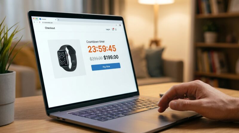
The ‘One-Tab Flash’ Strategy: Turn Abandoned Carts Into Your Highest-Converting 24‑Hour Sale
You can feel the pain of this one. You spend days planning the email, the banner, the discount, the countdown, and the traffic shows up. People browse. They add items to cart. Then they freeze at the finish line and disappear. Usually with three other tabs open, a phone buzzing, and just enough doubt to say, “I’ll come back later.” They rarely do. That is why the best ecommerce flash sale strategy for abandoned carts is not a louder site-wide sale. It is a quieter, tighter one. A cart-only 24-hour flash aimed at shoppers who already showed buying intent. Instead of blasting everyone with another fake-looking timer and popup circus, you give cart abandoners a clean checkout page, a real deadline, and a simple reason to finish now. Done right, this feels less like pressure and more like clarity. You are not chasing cold traffic. You are helping ready-to-buy shoppers stop hesitating.
⚡ In a Hurry? Key Takeaways
- The best ecommerce flash sale strategy for abandoned carts is a cart-only 24-hour offer, not a site-wide discount blast.
- Send stalled shoppers back to a stripped-down checkout with a real deadline, one clear incentive, and fewer distractions.
- Keep it honest. Fake timers and endless extensions hurt trust and train buyers to wait even longer next time.
Why regular flash sales stop working
Most stores make the same move when sales slow down. Bigger banner. Bigger discount. More emails. More urgency.
The problem is that customers have seen it all before. They know the “ends tonight” sale may come back next weekend. They know the popup timer might reset. And when every page screams for attention, checkout starts to feel risky instead of easy.
That is why so many flash sales create noise without fixing the real leak. The leak is not always traffic. It is hesitation from people who were already close to buying.
What the One-Tab Flash strategy actually is
The One-Tab Flash strategy is simple. You only show the 24-hour offer to shoppers who already added items to cart but did not complete checkout.
Then you send them back to one focused place. Not your home page. Not a category page. Not a sale collection with fifty choices. One checkout path. One tab. One decision.
The page should answer three questions fast:
- What is the offer?
- How long is it available?
- What do I need to do right now?
That is it. No clutter. No wandering.
Why this works better than a site-wide blast
It targets high-intent shoppers
These are not random visitors. They already picked products. They already imagined owning them. They may have even started entering shipping details. You are not creating demand from scratch. You are removing friction at the last step.
It avoids discount fatigue
A site-wide sale teaches people to expect discounts on everything. A cart-only flash feels more specific and more believable. It is tied to a real action they took.
It makes the decision smaller
Shoppers often abandon because the final step gets noisy. Shipping surprises. Too many form fields. Second thoughts. Comparison shopping. A focused checkout experience reduces all that. Fewer choices usually means more completed orders.
How to build a cart-only flash without making it feel gimmicky
1. Use a real 24-hour window
If the offer keeps coming back for the same shopper every day, trust drops fast. Make the deadline real. When it ends, it ends.
2. Keep the offer narrow and easy to understand
You do not need a massive discount. In many cases, one of these is enough:
- 10 percent off the cart
- Free shipping
- A small gift with purchase
- A bundle upgrade at checkout
The point is not to slash margin for everyone. The point is to give a hesitant buyer a clean reason to stop waiting.
3. Send them straight back to checkout
This part matters more than most brands realize. If your recovery email or SMS sends them back to a product page, you are reopening the whole decision process. Send them to a pre-loaded cart or saved checkout instead.
4. Strip distractions off the page
During the cart flash, remove anything that invites wandering. That means trimming navigation, reducing promo clutter, and keeping extra recommendations to a minimum. The page should feel calm.
5. Explain the savings in plain English
“Complete your order in the next 24 hours and save $18.” That works.
“Exclusive dynamic savings opportunity unlocked.” That does not.
What to include in the message
Your abandoned cart message should sound helpful, not desperate. A simple structure works best:
- A reminder of what they left behind
- The exact benefit of finishing now
- A real expiration time
- A direct link back to checkout
For example:
“Your cart is still waiting. Finish your order in the next 24 hours and get free shipping. Your items are saved here.”
That is much more convincing than shouting “FLASH SALE!!!” in all caps.
Common mistakes that hurt conversions
Using fake countdowns
People can spot fake urgency. If the timer resets on refresh, you have a trust problem.
Offering too many choices
If the customer lands on a page with upsells, cross-sells, popups, newsletter forms, and chat prompts, the flash loses focus.
Training shoppers to abandon on purpose
If every cart abandoner gets a better deal, repeat customers may learn to wait. The fix is to use this strategy carefully. Save it for selected segments, first-time buyers, high-value carts, or shoppers who stalled for a specific amount of time.
Discounting when friction is the real issue
Sometimes the shopper is not hesitating over price. They are confused by shipping cost, return terms, or payment options. A small checkout fix may do more than a bigger discount.
When this strategy works best
The One-Tab Flash strategy shines when your store already gets decent traffic, but promotions do not seem to lift much. You see carts filling, but revenue stays flat. That usually means your issue is not awareness. It is completion.
This is also a smart move if you are tired of training your full audience to wait for site-wide markdowns. A targeted cart flash protects margin better and feels more personal.
If you also want a way to warm up shoppers before they even reach the cart stage, it is worth reading The ‘VIP-Waitlist Flash’ Strategy: Turn Your “Maybe Later” Shoppers Into Your Highest-Intent 24‑Hour Buyers. That approach works earlier in the funnel, while the One-Tab Flash cleans up the final step.
A simple rollout plan
Week 1. Pick the segment
Start with one group, such as first-time cart abandoners over a certain order value.
Week 2. Build the checkout path
Create a saved-cart link, a clean checkout page, and one clear offer.
Week 3. Write one email and one SMS
Do not overcomplicate it. Reminder, benefit, deadline, link.
Week 4. Measure the right numbers
Watch completed orders, recovered revenue, average order value, and how many shoppers return without buying. Compare the cart-only flash against your normal abandoned cart flow.
At a Glance: Comparison
| Feature/Aspect | Details | Verdict |
|---|---|---|
| Target audience | Only shoppers who already added to cart and stalled at checkout | Higher intent, better chance of fast conversions |
| Offer experience | Single checkout-focused page with a real 24-hour incentive and minimal distractions | More credible and easier to act on than a noisy site-wide sale |
| Margin impact | Discount is limited to stalled carts instead of your full customer base | Smarter use of promos, with less revenue cannibalization |
Conclusion
Right now, brands are piling into louder site-wide flash sales, which means your customers’ feeds and inboxes are packed with generic countdowns they barely notice anymore. A focused cart-only flash gives you an edge because it fixes the quiet problem most stores ignore. High-intent shoppers are already in your checkout, but they are stalling. By moving the urgency and the offer into one stripped-down experience, you make the only decision on that page very easy. Finish the order at a price that really will not be there tomorrow. It is a small build, but it can pay off in a big way, especially if your store already has steady traffic and every broad promo seems to shuffle the same revenue around instead of growing it. Start small, keep it honest, and make checkout feel simple again.