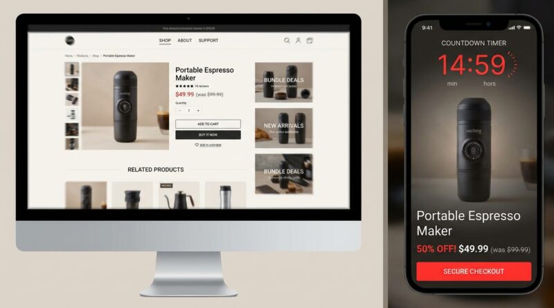
The ‘One-Click Rush Flash’ Strategy: Turn Every Product Page Into A 15‑Minute Deal Trap
You paid for the click. Then your own product page talks the shopper out of buying. That is the maddening part. A flash sale ad promises one thing, but the landing page looks like every other page on your store. Menus at the top. Related products halfway down. Popups, bundles, reviews, and enough links to send a buyer wandering off in under three seconds. By the time they figure out what is discounted, the urgency is gone. A smart ecommerce flash sale product page strategy fixes that without forcing you to rebuild your whole site. The idea is simple. Keep your normal product page for regular visitors, but create a “rush” version that appears only for flash sale traffic. Strip out navigation. Show one clear sale price. Add a real timer. Pin a sticky buy button on scroll. Now your paid clicks land in a focused, 15-minute buying window instead of a casual browsing session.
⚡ In a Hurry? Key Takeaways
- Turn flash sale traffic into a distraction-free product page with one price, one timer, and one main checkout action.
- Use UTM tags or referral rules so only ad clicks, email taps, or TikTok traffic see the rush version.
- Do not rebuild your whole store. Start with your existing product template and hide the parts that kill urgency.
Why normal product pages fail during flash sales
A standard product page is built for browsing. A flash sale is not.
Normal pages try to answer every possible question, cross-sell other items, and keep people exploring your catalog. That works fine when someone is comparing options. It works badly when someone tapped a “15 minutes only” offer and expects a straight path to checkout.
The biggest problem is mixed signals. Your ad says “buy now.” Your page says “have a look around.” Those are two very different moods.
That is why this ecommerce flash sale product page strategy matters. You are not trying to make the page prettier. You are trying to make it faster to understand and harder to drift away from.
What a “one-click rush flash” page actually looks like
Think of it as a temporary mode, not a brand new website.
1. Remove escape routes
Hide the top navigation, footer promos, category links, and “you may also like” blocks. During a flash sale, every extra link is a chance to lose the sale.
2. Show one price clearly
The discount should be obvious at a glance. Put the sale price near the product title and buy button. If there is an original price, keep it small and crossed out. No math required.
3. Add a visible countdown timer
The timer should sit near the call to action, not tucked in a banner. Keep it honest. If the offer ends in 15 minutes, the timer should really end in 15 minutes.
4. Pin the checkout button on scroll
On mobile, this is huge. If shoppers scroll to read details or reviews, the buy button should stay within reach. A sticky bar with product name, sale price, and “Buy Now” works well.
5. Keep the page focused on one action
If the page has one purpose, the visitor should feel it. Fewer variants, fewer upsells, fewer choices. Urgency and too many decisions do not mix well.
How to set it up without building separate landing pages
This is the part store owners usually overcomplicate.
You do not need a brand new page for every offer. In most cases, you can use your current product template and apply a “rush state” when a visitor arrives from a certain source.
Use URL rules
Add a simple parameter or UTM rule to your flash sale links. For example, traffic with specific campaign tags can trigger a cleaner page layout.
That means:
- Facebook ad clicks can see the flash version
- TikTok swipe-ups can see the flash version
- Email campaign visitors can see the flash version
- Organic search and regular shoppers can still see the standard product page
Hide, do not destroy
In many themes, you can conditionally hide page elements rather than redesign everything. Menus, recommendation blocks, and newsletter popups can be turned off only for that rush state.
Keep your product data the same
The product stays the product. Inventory, images, checkout, and fulfillment do not need to change. You are changing the presentation layer, not rebuilding the engine underneath it.
What to include on the page, and what to cut
If you are unsure what belongs on a flash page, use this simple test. Does this element help someone buy right now? If not, it probably does not belong.
Keep these
- Product title
- Main image or short image gallery
- Sale price
- Short benefit-led description
- Countdown timer
- Shipping or delivery note
- Sticky checkout button
- Trust markers like secure checkout or returns summary
Cut or minimize these
- Full navigation menus
- Related products
- Long brand story sections
- Popup offers that interrupt checkout
- Complicated bundles
- Massive review walls above the buy button
You are not trying to make the page empty. You are trying to keep it calm and obvious.
Where this works especially well
This approach is useful if your traffic comes from channels where people move fast and attention is thin.
- Paid social ads
- Influencer swipe-ups
- TikTok product clips
- SMS blasts
- Email flash sale campaigns
- Retargeting ads with limited-time offers
It also pairs nicely with customer support selling. If your team closes sales in messages, a focused rush page gives those buyers somewhere clean to land. That is similar to what we covered in The ‘Reply-Only Flash’ Strategy: Turn Support DMs Into A One-Hour Sellout Window, where the sales moment starts inside a conversation and then moves into a short buying window.
Mistakes that quietly kill urgency
Fake scarcity
If every visitor sees the same “15 minutes left” clock all week, people catch on. Trust drops fast.
Too many discounts on one page
Do not stack coupon boxes, automatic discounts, and bundle deals all over the place. One offer should feel like the offer.
Slow page load
A countdown timer does not help if the page takes five seconds to appear. Compress images. Remove junk scripts. Check mobile speed first.
Mobile clutter
Many flash clicks happen on phones. A page that looks acceptable on desktop can feel chaotic on a small screen. Test thumb reach, sticky buttons, and text size.
Sending every visitor into rush mode
Not everyone should see this version. Flash urgency works best when tied to campaign intent. If random shoppers land there from search, it can feel pushy and out of place.
How to measure whether it is working
You do not need fancy analytics to spot improvement.
Start with these numbers:
- Add-to-cart rate
- Checkout start rate
- Conversion rate from flash traffic
- Bounce rate on campaign visits
- Revenue per visit from paid traffic
Compare your normal product page against the rush version for the same product. If the focused version is doing its job, fewer people wander and more people buy.
Also watch for support tickets and refund reasons. If buyers seem confused, your page may be too stripped back. The sweet spot is focused, not misleading.
At a Glance: Comparison
| Feature/Aspect | Details | Verdict |
|---|---|---|
| Standard product page | Menus, upsells, related items, full browsing layout, slower path to checkout | Fine for browsing, weak for urgent flash traffic |
| Rush flash version | No navigation, one clear price, timer near CTA, sticky checkout button on scroll | Best choice for 15-minute deal campaigns |
| Targeting method | Show the rush state only for specific UTM tags or referral sources | Smart way to protect your regular store while improving paid traffic conversion |
Conclusion
Most small stores do not have a traffic problem. They have a landing problem. They are sending paid and social visitors into product templates built for casual browsing, then wondering why the flash sale feels flat. A one-click rush state fixes that without forcing a full redesign. You keep your existing theme, but flip any page into a high-focus, 15-minute deal trap with no navigation, no distractions, one clear price, a visible timer, and a sticky checkout button that stays put while people scroll. Better yet, you can trigger it only for specific UTM tags or referral sources, so ad clicks and TikTok swipes get the time-boxed version while everyone else sees your normal product page. That means better flash-sale conversion from traffic you are already paying for, without building separate landing pages for every offer or messing up your full-price positioning for regular visitors.