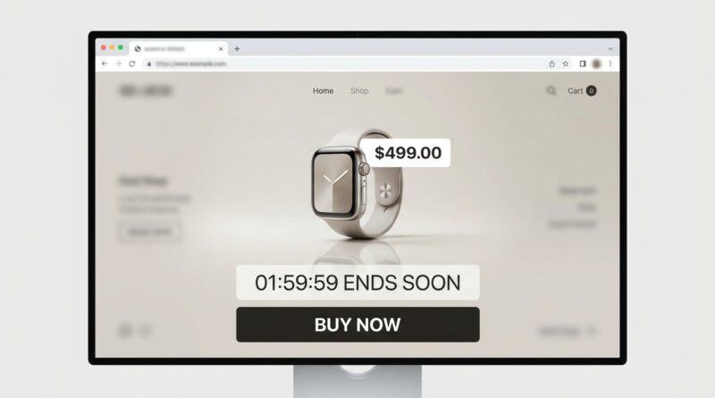
The ‘Single-Page Flash’ Strategy: Turn One Clean Deal Page Into A 3X Higher Conversion Sale
You can spend all week building a flash sale and still watch it flop for one annoying reason. The deal is there, but shoppers have to hunt for it. They land on your homepage, see a popup, a hero banner, a sale tab, a bundle offer, a newsletter box, and three different buttons asking them to do three different things. That is not excitement. That is friction. If people need a minute to figure out what is actually on sale, many will leave and tell themselves they will come back later. They usually do not. A single page flash sale strategy fixes that by giving one offer, one page, and one clear next step. It is simpler for shoppers, easier for your team to measure, and much less likely to mess with the rest of your store’s full-price browsing. Sometimes better sales do not come from more noise. They come from less of it.
⚡ In a Hurry? Key Takeaways
- A single page flash sale strategy often converts better because it gives shoppers one offer, one message, and one action.
- Send all sale traffic to a dedicated page with a fast load time, one main CTA, clear pricing, and a visible countdown.
- This setup protects your margins and your data by keeping the sale contained instead of spreading discounts across your whole store.
Why the usual flash sale setup underperforms
Most stores do not fail because the discount is weak. They fail because the path is messy.
A shopper clicks a sale email expecting to see the deal right away. Instead, they land on a general storefront. Now they have to search, scroll, close a popup, and guess which products are included. Every extra step gives them a chance to quit.
That is why the single page flash sale strategy works so well. It removes the guesswork. One page holds the headline, the product or collection, the discount, the time limit, the proof, and the buy button. Nothing else fights for attention.
What a single page flash sale strategy actually is
Think of it as a mini sales room, built for one short event.
Instead of pushing people into your full storefront, you send traffic to one clean landing page built around a single offer or a tight group of related products. The page has one job. Turn interest into checkout starts.
What belongs on the page
Keep it simple:
- A plain headline that says what the offer is
- A short subhead that explains who it is for or why it matters
- The featured product or a very small product set
- Clear pricing, with the savings easy to spot
- One main call to action
- A real end time
- Light social proof, like reviews or units sold
- Basic FAQ content, such as shipping and returns
What does not belong there? A giant menu. Side quests. Five banners. Ten unrelated recommendations. Anything that pulls the eye away from the offer.
Why it can lift conversions so sharply
Three things usually happen when you strip a flash sale down to one page.
1. Shoppers make decisions faster
People are not lazy. They are busy. If your page makes them think too hard, they pause. Pauses kill urgency.
A single sale page reduces decision fatigue. Visitors know exactly what is being offered and what to do next. That alone can improve click-to-cart rates.
2. Your data gets much cleaner
When every email, ad, SMS, and social post points to the same sale page, your reporting gets easier in a hurry.
You can track page views, clicks, add-to-carts, and conversions without trying to untangle what happened across a dozen category pages. You can finally answer simple questions with confidence. Did the headline help? Did the countdown help? Did mobile visitors bounce because the page was too slow?
3. You protect the rest of your store
This is the part many teams miss. A sitewide sale can train people to wait for discounts. It can also drag full-price browsing into a discount spiral.
A dedicated page contains the event. Your best deal stays in its own lane instead of taking over the whole shopping experience.
How to build the page without overcomplicating it
You do not need a fancy rebuild. You need discipline.
Start with one offer
The best single page flash sale strategy usually centers on one hero product, one bundle, or one tight category. If you cram in too many offers, you recreate the same clutter you were trying to escape.
Write like a real person
Your headline should be obvious, not clever. Try something like “48-Hour Flash Sale: 25% Off Our Best-Selling Starter Kit.” Nobody should need to decode it.
Use one main CTA
Pick a button label and stick to it. “Shop the Flash Sale” or “Get the Deal” is enough. If one section says “Buy Now,” another says “Claim Offer,” and another says “See Options,” you are splitting attention.
Make the page fast
Flash sales often come from mobile traffic. Heavy images, scripts, popups, and widgets can slow things down at exactly the worst time. Trim what you can. Fast pages feel more trustworthy and convert better.
Put the basics near the button
Price, discount, shipping window, and return policy should not be buried. When shoppers hesitate, it is often because one practical question is unanswered.
What to test first
Once you have a clean page, optimization gets a lot less chaotic.
Test the headline
Try a discount-first version against a product-first version. Some audiences care most about savings. Others care about what problem the product solves.
Test the countdown style
A real deadline helps, but not every timer design helps. Sometimes a small fixed bar at the top works better than a giant animated clock.
Test page length
For lower-cost products, shorter often wins. For more expensive items, a bit more reassurance can help. The point is that with one dedicated page, these tests become clean and useful.
Where this works especially well
This approach shines during noisy sales periods, product drops, inventory pushes, and creator campaigns.
If you are pairing a flash sale with social traffic, it fits even better. For example, if you are driving urgency through live content, a focused destination page makes that traffic far more likely to convert. That is part of why The ‘Micro-Live Flash’ Strategy: Turn 20-Minute TikTok Lives Into Your Highest-Converting Sale of the Week is such a smart companion idea. Short bursts of attention work best when they land somewhere clean.
Mistakes to avoid
Turning the page into a regular collection page
If it looks and behaves like every other page on your site, you lose the point. A flash sale page should feel focused and temporary.
Adding too many products
More choice can mean fewer purchases. Keep the offer tight.
Forgetting mobile layout
If your timer covers the button or your images push the price too far down, mobile shoppers will bail.
Using fake urgency
If the countdown resets tomorrow with the same offer, people notice. Real urgency builds trust. Fake urgency burns it.
Who should try this first
If your team keeps saying, “We need more traffic,” but your sale pages are cluttered and your tracking is muddy, start here first.
This is especially useful for lean ecommerce teams that do not have time to untangle a giant promotional setup. One page is easier to build, easier to QA, easier to monitor, and easier to improve after the sale ends.
At a Glance: Comparison
| Feature/Aspect | Details | Verdict |
|---|---|---|
| Shopper experience | Single page shows one clear deal, one path, and less clutter than a general storefront | Big win for reducing drop-off |
| Tracking and testing | Traffic goes to one destination, making click, cart, and conversion data easier to read | Best choice for clean optimization |
| Impact on the rest of the store | Keeps the discount event contained instead of pushing all browsing toward markdowns | Safer for brand and margins |
Conclusion
Most ecommerce teams are scrambling for more reach when what they actually need is more focus. That is the real value of a single page flash sale strategy. It cuts decision fatigue for shoppers, makes tracking and optimization much easier for your team, and keeps your best deal from swallowing the rest of your store. In a week full of noisy discounts and endless banners, a dedicated sale page feels calmer, cleaner, and more intentional. And that calm often converts better than chaos ever will.