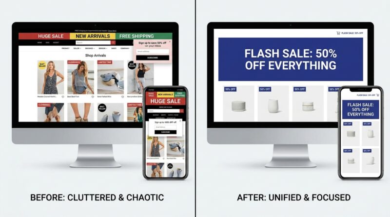
The ‘Offer-Clarity Flash’ Strategy: Make Your Deal Obvious In 3 Seconds And Watch Clicks Jump
You can have a real discount, solid products, and plenty of traffic, then still watch a flash sale flop because shoppers cannot tell what the deal actually is. That is maddening, especially when you open your site and see a top bar, a homepage banner, a product badge, and maybe a code field all saying slightly different things. People do not stop to figure it out. They leave. The good news is that ecommerce flash sale offer clarity is usually fixable without a redesign or a bigger ad budget. The trick is what I call the Offer-Clarity Flash strategy. Give visitors one message, one discount path, and one visual system they can understand in about three seconds. If they instantly know what the deal is, who it is for, and when it ends, clicks usually rise because the sale finally feels easy to trust and easy to use.
⚡ In a Hurry? Key Takeaways
- Make your flash sale understandable in 3 seconds with one headline, one discount, and one clear end time.
- Use auto-discounts, matching theme sections, and a single visual style so the sale feels clean instead of chaotic.
- Set an end plan before launch so banners, badges, timers, and sale prices do not linger after the promo ends.
Why flash sales fail when the offer is fuzzy
Most shoppers do not read your sale like a contract. They scan. Fast.
If they land on your store and see “Up to 50% off,” “Buy more save more,” “Use code FLASH20,” and “Ends tonight,” they now have homework. Which offer is the real one? Does the code stack? Is this site trying too hard? Is the timer even real?
That confusion kills momentum.
Offer clarity matters because flash sales depend on speed. The customer should not need to click around to understand the deal. They should know it almost instantly.
The 3-second test
Here is the simplest test I know for ecommerce flash sale offer clarity.
Open your sale page on your phone. Look at it for three seconds. Then ask:
- What is the offer?
- Who gets it?
- When does it end?
- What should I click next?
If any answer is fuzzy, your sale is doing extra work on the shopper instead of for the shopper.
The Offer-Clarity Flash strategy
1. Pick one lead offer
This is the big one. Do not run three competing deals unless you enjoy self-inflicted confusion.
Choose one primary offer such as:
- 20% off sitewide
- Buy 2 get 1 free
- Free gift with orders over $75
Then build the whole sale around that single message.
Yes, you can have exclusions in the fine print. No, the fine print should not become the main event.
2. Say it the same way everywhere
Your announcement bar, hero banner, collection cards, product pages, cart, and checkout should all describe the promotion in the same plain language.
Bad example:
- Top bar says “Weekend Blowout”
- Hero says “Extra 25% with code”
- Product page says “Limited markdown”
- Cart says “Savings applied at checkout”
Good example:
- “Today only. 25% off sitewide. Discount auto-applies. Ends at midnight ET.”
Same message. Same terms. Same timing.
3. Use one discount path
If possible, skip the mystery code.
Auto-discounts are cleaner because they remove one more thing the customer has to remember. They also cut down on support emails from people asking why the code did not work.
If you must use a code, make it impossible to miss. Show it once in the hero, once in the cart, and add a quick copy button if your platform allows it.
But do not mix “automatic savings” and “enter code” unless there is a very good reason. That is how trust gets shaky.
Design it so the deal feels obvious, not loud
One visual language beats five sale badges
A common mistake is trying to make the sale feel exciting by adding more stuff. More stickers. More colors. More banners. More urgency.
Usually that just creates noise.
Pick one sale color, one badge style, and one timer style. Keep it consistent across the store. If your sale uses red badges on product cards, use that same red in the top bar and countdown block. If your CTA says “Shop the Sale,” use that wording everywhere.
This creates a simple mental shortcut. Customers start to recognize what is part of the promo and what is not.
Make the first screen do the heavy lifting
Above the fold on mobile, the shopper should see:
- A clear sale headline
- A short explanation
- The end time
- A button to shop
That is enough.
You do not need a paragraph about your brand story in the middle of a flash sale landing page. Save that for another visit.
Good sale copy is boring in the best way
Clarity beats cleverness here.
Instead of:
“Blink and it’s gone. Our wildest drop yet.”
Try:
“48 hours only. Buy 2, get 1 free on all summer tees.”
The second version may sound less dramatic. It also tells people exactly what they need to know.
How to build it cleanly in Shopify
Sync your sections before launch
One reason sale pages feel half-broken is that different parts of the theme get updated by different people at different times. The homepage changes. The product badges do not. The cart notice still mentions last month’s free shipping promo.
Before launch, make a short checklist for every sale surface:
- Announcement bar
- Homepage hero
- Collection banners
- Product page badges
- Cart drawer message
- Email links
- SMS links
- Sticky add-to-cart area
Everything should match the same offer language.
Use auto-discounts where possible
Shopify merchants especially can save themselves a lot of mess by using automatic discounts for simple sitewide or collection-based sales.
That reduces checkout friction and keeps the offer from feeling like a puzzle. It also lowers the chance that a customer leaves because they forgot the code or think the discount is fake.
Set timers carefully
Countdown timers work best when they are accurate and consistent.
If the hero says the sale ends in 4 hours but the cart says 6 hours, you have a credibility problem. If the timer hits zero and the sale still appears active, people notice that too.
Use one time source. One timezone. One end rule.
And test it on mobile.
The hidden part merchants forget: the end plan
A lot of community complaints are not about launching sales. They are about cleaning them up.
Banners linger. Compare-at prices stay live. Product badges keep shouting “Flash Sale” two days later. This makes the store feel sloppy and can train customers not to believe future urgency.
Create a shutoff checklist
Before the sale starts, decide exactly how it ends.
- When does the auto-discount turn off?
- When do timers disappear?
- When do sale badges get removed?
- When does the homepage hero revert?
- Do abandoned cart flows need updated copy after the sale ends?
If possible, schedule these changes in advance. At minimum, assign someone to own the rollback.
This is not glamorous work. It is the difference between a crisp promo and a messy one.
What to avoid during a flash sale
- Stacking multiple discounts with unclear rules
- Using vague words like “huge savings” without a real number
- Showing different end times in different places
- Making users hunt for the code
- Adding popups, spin wheels, and bars that fight each other
- Leaving old sale assets active after the event
When you do want more than one deal
Sometimes a single offer is not the right fit. Maybe you want to roll deals in waves or protect margin on certain categories. That can work, but only if the customer still sees one clear message at a time.
If you are planning staggered promotions, it is worth reading The ‘Drop-Shift Flash’ Strategy: Mirror Prime‑Style Deal Waves Without Killing Your Margins. The smart lesson there is not “add more offers.” It is “sequence offers so shoppers understand what matters right now.”
A simple offer-clarity template you can copy
Here is a basic structure that works well for many DTC and Shopify stores:
Top bar
Today only. 20% off sitewide. Auto-applied at checkout. Ends 11:59 PM ET.
Hero headline
20% Off Sitewide. Today Only.
Hero subtext
No code needed. Discount applies automatically at checkout.
Primary button
Shop the Sale
Product badge
Flash Sale
Cart note
Your 20% flash sale discount is applied automatically.
Notice how none of this is fancy. That is the point. It is easy to understand and hard to misread.
At a Glance: Comparison
| Feature/Aspect | Details | Verdict |
|---|---|---|
| Single clear offer | One main discount, explained the same way across banners, pages, and cart. | Best for fast understanding and stronger click-through. |
| Code-based vs auto-discount | Codes add friction and can confuse users. Auto-discounts remove a step. | Auto-discount usually wins unless a code is required for a specific reason. |
| Promo cleanup | Scheduled rollback for timers, badges, sale prices, and homepage sections. | Essential for trust and for avoiding sloppy post-sale leftovers. |
Conclusion
Right now, merchants in Shopify, DTC, and TikTok communities are all complaining about one quiet killer of flash sales: offer clarity. They are not always asking for better products or bigger discounts. They are asking how to make the sale obvious without turning the site into a yard sale of badges, bars, and timers. They are also asking how to stop old promo pieces from hanging around after the clock runs out. That is why this approach matters. One message, one discount, one visual language, plus a clean setup behind the scenes for theme sections, auto-discounts, and timers. Get that right, and your sale feels trustworthy, quick to grasp, and easy to shop. Better still, you can squeeze more revenue out of the traffic you already have, without needing a bigger list or bigger ad spend.