The ‘Widget Stack Flash Sale’ Strategy: Turn Your Whole Site Into One Big Countdown
Nothing kills a flash sale faster than mixed signals. You put a countdown bar at the top of the site, a promo graphic on the homepage, a discount note on product pages, and somehow none of them quite match. Shoppers notice. They may not email to complain, but they hesitate, click away, or tell themselves they will come back later. Most never do. That is the real problem. It is not that your offer is weak. It is that your sale story is scattered.
A smart ecommerce flash sale widget strategy fixes that by turning your whole site into one clear, synchronized message. Same deadline. Same offer. Same urgency. A top bar reminds people the clock is ticking. A hero banner explains the deal fast. A product page widget confirms the discount right where buying decisions happen. An exit popup gives one last nudge before they leave. You do not need a big rebuild or a developer glued to Slack all day. You need a simple widget stack that acts like one campaign instead of five disconnected parts.
⚡ In a Hurry? Key Takeaways
- A strong ecommerce flash sale widget strategy puts the same offer and countdown in every key spot a shopper looks.
- Start with four widgets: announcement bar, hero banner, product page timer, and exit intent popup.
- Keep every widget synced to one deadline and one message, or you risk confusion that hurts sales.
Why flash sales fail even when the discount is good
Most stores do not have a traffic problem during a flash sale. They have a clarity problem.
A shopper lands on your site and has about three seconds to figure out what is happening. If the top bar says “Ends Tonight,” the homepage says “48 Hour Deal,” and the product page says nothing at all, that moment is gone.
People do not stop and investigate. They leave.
This is why the best flash sale campaigns now feel less like a one-off promo and more like a site takeover. Not in an annoying way. In a clear way. The shopper gets one simple story repeated across the store, so they understand the deal without having to hunt for it.
What a widget stack actually means
A widget stack is just a small set of on-site elements working together.
Think of it like signs in a supermarket. One sign at the front door helps. But signs at the shelf, the aisle end, and the checkout are what make the sale feel real and easy to act on.
For ecommerce, that usually means:
- A sticky announcement bar
- A homepage hero banner
- A product page countdown or promo badge
- A cart or checkout reminder
- An exit intent popup
The trick is not adding more stuff. It is making each widget repeat the same message at the right moment.
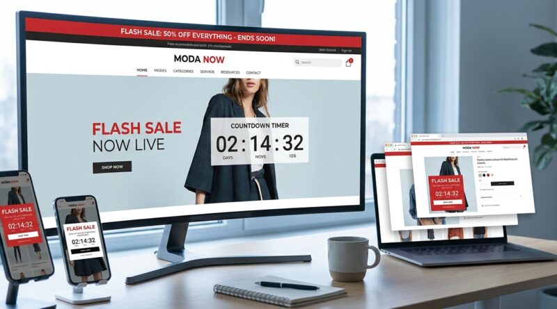
The four-widget setup that works for most stores
1. The top announcement bar
This is your always-visible reminder. Keep it short.
Good example: “Flash Sale. 25% off selected items. Ends in 03:14:22.”
Bad example: “Welcome to our biggest promotion event featuring amazing limited-time savings across multiple categories.”
No one reads that. Be blunt. Be useful.
Your top bar should do three jobs. It should name the sale, show the benefit, and show the deadline.
2. The hero banner
Your hero section is where the sale gets context. This is where you answer the shopper’s first question: “What exactly is on sale?”
Spell it out. “Today only. Buy any 2 skincare items and get 30% off.” Then add a clear button.
If your sale has rules, simplify them here. Do not make people click through three pages to decode the promo.
3. The product page widget
This is the money spot.
Many stores do a decent homepage promo and then go silent on the actual product page. That is like putting a giant sign outside a store and then hiding the discount at the shelf.
Place the sale reminder close to the price and Add to Cart button. This is where urgency matters most. A countdown timer, discount badge, or “Sale ends tonight” note can reduce hesitation right when someone is deciding.
4. The exit intent popup
Used badly, these are irritating. Used well, they save sales.
If someone is leaving a sale page, show a final reminder tied to the same deadline. Not a random newsletter signup. Not a different discount. Stay on message.
Something simple works best: “Still thinking it over? Your 25% flash sale ends in 2 hours.”
That kind of consistency is what makes the whole stack feel intentional.
One deadline, one message, one source of truth
This is the part many teams miss.
If each widget is edited by hand, mistakes creep in fast. One timer gets updated. Another does not. Someone changes the discount copy on the homepage but forgets the product template. Suddenly your short, high-pressure sale turns into a trust problem.
The fix is boring but important. Build your ecommerce flash sale widget strategy around one campaign setting.
- One official start time
- One official end time
- One approved headline
- One discount description
- One visual style
If your tools let you sync these widgets from one dashboard, great. If not, at least create one campaign brief and do a quick site check before launch.
Flash sales are short. Small mistakes matter more because there is less time to recover.
Where each widget helps in the buying journey
Different widgets solve different problems.
- Announcement bar: catches attention right away
- Hero banner: explains the offer clearly
- Product page timer: adds urgency at decision time
- Cart reminder: stops second thoughts
- Exit popup: gives one last save attempt
That is why stacking matters. A single widget can be missed. A coordinated set creates repetition without forcing the shopper to work for the information.
And if your team also handles a rush of buyer questions during these promos, it is worth reading The Live Chat Flash Sale: Turn Support Windows Into Instant Revenue Surges. It pairs nicely with a widget stack because urgency gets more people clicking, and live chat helps catch the ones who still need a quick answer before buying.
How to keep urgency from turning into chaos
Urgency is useful. Confusion is expensive.
Here are a few ground rules that keep your sale sharp instead of messy:
Keep the wording identical
If the sale is “Ends at midnight,” say that everywhere. Do not switch between “today only,” “ending soon,” and “last chance” unless they all point to the same exact thing.
Do not stack too many promos
If your flash sale is the star, let it be the star. Pause unrelated popups and side offers if they distract from the main campaign.
Make mobile the priority
Most shoppers will see your sale on a phone. Check that the timer fits, the button is visible, and the popup does not cover the whole screen like a digital bedsheet.
Test the journey yourself
Open the homepage, a collection page, a product page, the cart, and the exit flow. If the deal feels inconsistent to you, it will feel worse to customers.
Simple metrics to watch during the sale
You do not need a giant analytics project. For most stores, these numbers tell the story fast:
- Click-through rate from the announcement bar
- Homepage hero clicks
- Product page add-to-cart rate
- Cart completion rate
- Popup conversion or recovery rate
- Revenue per visitor during the sale window
If the top bar gets views but few clicks, your message may be too vague. If product pages get traffic but add-to-cart stays flat, the urgency element near the buy button may be too weak or too far down the page.
You are not looking for perfect data. You are looking for the weak spot in the chain.
Common mistakes that make a flash sale feel sketchy
Shoppers are quick to spot anything that feels off.
- Different countdowns on different pages
- Promo text that changes from one step to the next
- A popup discount that conflicts with the main sale
- Widgets that cover important buttons on mobile
- Timers that restart on refresh
That last one is especially bad. If the timer resets, people stop trusting the whole campaign.
A flash sale should feel urgent, not fake.
At a Glance: Comparison
| Feature/Aspect | Details | Verdict |
|---|---|---|
| Single widget vs stacked widgets | One banner can be missed. A coordinated stack repeats the sale at key decision points across the site. | Stacked widgets usually win for clarity and conversions. |
| Manual updates vs synced campaign settings | Manual edits are easy to mess up during a fast sale. Synced settings keep timers, copy, and deadlines consistent. | Synced is safer and much easier to manage. |
| Urgency vs overload | A few focused widgets can push action. Too many popups, banners, and extra promos can annoy shoppers. | Use a clean, consistent setup, not a noisy one. |
Conclusion
A good flash sale should feel obvious the second someone lands on your site. That is the real win of a clean ecommerce flash sale widget strategy. You stop making shoppers hunt for the deal and start showing it clearly, everywhere it matters. That helps the community today because attention is brutally fragmented and most stores are leaking flash sale clicks in the first three seconds. A clean widget stack solves that fast: shoppers see the same deadline at the top of the page, in the hero image, next to the add to cart button and even when they go to leave, which lifts click through, boosts urgency and reduces the tech chaos that usually comes with running short high-pressure promos. Keep it simple, keep it synced, and your next flash sale has a much better shot at feeling like one confident campaign instead of a jumble of parts.