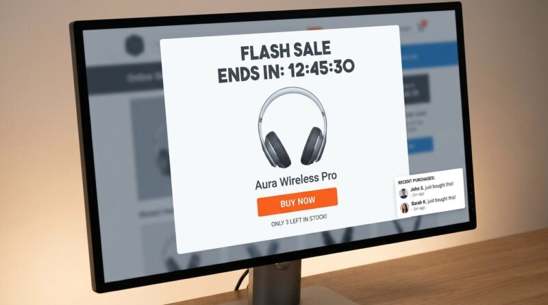
The ‘Solo-Deal Landing’ Strategy: Turn One Product Page Into A Flash Sale Powerhouse
Flash sales often fail for a boring reason. The deal is real, but the path to it is a mess. A shopper clicks your ad, lands on a busy homepage, sees 40 categories, two pop ups, a sticky bar, and a search box. Then they leave. That is frustrating because the problem usually is not the product or even the discount. It is the detour. A smart ecommerce flash sale landing page strategy fixes that by sending people to one focused page built around one offer. No scavenger hunt. No mixed signals. Just the exact item, exact price, exact deadline, and a clear button to buy. This works especially well when shoppers are tired of generic “sale ends tonight” noise. If your flash sale traffic feels expensive and your conversion rate feels soft, the fix may be simpler than you think. Stop spreading urgency across your whole store. Put it all on one page that does one job well.
⚡ In a Hurry? Key Takeaways
- Use a standalone page for each flash sale, centered on one hero product and one promise.
- Match your ad, email, or social post wording to the landing page so shoppers see exactly what they clicked for.
- Show real stock and time limits honestly. Fake urgency may lift clicks once, but it hurts trust and repeat sales.
Why most flash sales lose people in the middle
Here is the usual pattern. You run ads, send an email, maybe get a creator to post about the offer. Traffic comes in. Then the shopper lands on a general collection page or your homepage and has to figure out where the deal actually is.
That is the leaky middle of the funnel. People had intent a second ago. Then you made them work.
A better ecommerce flash sale landing page strategy treats the sale like a mini event. One page. One featured product. One deadline. One call to action.
This is not fancy. It is just clear. And clear converts.
What a solo-deal landing page actually is
Think of it as a temporary product page with extra focus. It is built for a short promotion, not for browsing.
It should include a few simple things
A strong headline that mirrors the ad or email. The sale price and regular price near the top. A product image or short video that loads fast. A visible countdown. Honest inventory status. Key benefits in plain English. Reviews or proof points. One main button to buy.
That is the core of it.
If you give the shopper too many side quests, the urgency drains away. This page should feel like a straight hallway, not a shopping mall.
Why this works better in 2026
Customers have seen every trick in the book. “Ends at midnight.” “Last chance.” “Today only.” Then the same brand sends the same message three days later.
People are numb to that now.
What still works is relevance and consistency. If an Instagram story says “25% off our espresso grinder. 120 units only,” the click should land on a page that says exactly that. Same grinder. Same number. Same offer. Same timing.
That removes doubt. It also saves attention, which is usually the real scarce resource during big promo windows.
The pieces of a flash sale page that do the heavy lifting
1. A headline that matches the click
If your ad says “48-hour deal on the AirLite carry-on,” your page should not open with “Welcome to our holiday event.” It should say “48-hour deal on the AirLite carry-on.”
This sounds small. It is not. Message match reassures the shopper that they are in the right place.
2. One hero product, not five decent options
Choice can help in normal shopping. In a flash sale, it often gets in the way. Pick one main product and make that the star.
You can add a small “you may also like” section lower on the page if needed, but do not let it compete with the main deal.
3. Honest urgency
A countdown timer can help if it is real. Same with stock levels. “Only 17 left” works when it is true. It backfires when shoppers see the same number every hour for two days.
Trust is part of conversion. Especially if you want customers to come back after the sale.
4. Fast loading and low friction
This is huge on mobile. Compress images. Keep scripts under control. Remove extra pop ups. Let Apple Pay, Shop Pay, or other fast checkout options do their job.
The page should feel instant. If urgency is your message, speed should be your design.
5. A clear buy path
Put the add-to-cart or buy-now button high on the page. Repeat it lower down after the details. Do not hide shipping info, return terms, or delivery dates. That kind of uncertainty kills impulse purchases.
How to build this without rebuilding your whole store
The nice part is that you do not need a huge redesign. Most brands can do this with a landing page template and a bit of discipline.
Start with this simple structure
Top section: product image, sale headline, pricing, countdown, stock note, buy button.
Middle section: three to five benefits, short social proof, shipping and returns.
Lower section: FAQ, creator quote or customer review, maybe a very small cross-sell area.
That is enough for many offers.
Keep the navigation light
You do not have to remove your whole site menu, but this is one place where less is often more. Every extra link is a chance to wander off.
Where traffic should come from
This strategy shines when every traffic source points to the same page.
Paid social. Search ads. SMS. Email. Organic posts. Affiliate links. Creator stories. If they all promise the same deal, they should all land in the same place.
That lets you measure performance cleanly too. Instead of guessing whether the homepage helped or hurt, you can look at one page and one offer and make fast changes.
What to measure so you know it is working
Do not stop at revenue.
Watch these numbers
Landing page conversion rate. Add-to-cart rate. Bounce rate. Page load speed. Checkout completion rate. Revenue per visitor. Cost per acquisition by traffic source.
If your message match is strong and the page is doing its job, you should usually see lower bounce and stronger conversion without needing a bigger discount.
Common mistakes that quietly kill the page
The first mistake is sending traffic to a collection page because it feels easier. It is easier for the brand, not for the shopper.
The second is making the page look like every other product page. If it does not feel time-sensitive, shoppers will treat it like something they can revisit later.
The third is fake scarcity. This one is tempting and shortsighted. If you want urgency without teaching customers to game your promos, it is worth reading The ‘Guardrail Flash’ Strategy: Run Aggressive Deals Without Training Shoppers To Wait. It fits nicely with this solo-deal approach because both ideas protect margin and trust while still making the promotion feel special.
Best use cases for a solo-deal page
This works especially well for hero products, giftable items, seasonal bestsellers, overstock you want to move cleanly, and products that already perform well in paid ads.
It is also great during crowded retail moments like Black Friday week. Not because it is flashy, but because it cuts through the noise. Instead of asking people to explore your store during the busiest shopping week of the year, you hand them one sharp, easy decision.
A practical rollout plan
Week 1: Pick the right product
Choose an item with strong margins, good reviews, and a simple value story.
Week 2: Build the page
Use your product page as the base, then strip away distractions. Add the promo elements and speed-test it on mobile.
Week 3: Align the creative
Make sure your ads, subject lines, SMS copy, and creator briefs all use the same core promise.
Week 4: Run and learn
Launch the campaign. Watch where people drop off. Adjust headline, button copy, page speed, and proof elements before changing the discount.
At a Glance: Comparison
| Feature/Aspect | Details | Verdict |
|---|---|---|
| Traffic destination | Homepage or collection pages force shoppers to hunt. A solo-deal page shows the exact offer right away. | Solo-deal page wins for clarity and conversion. |
| Urgency presentation | Generic sitewide banners feel stale. Real timers and truthful inventory on one product page feel more believable. | Focused urgency works better than broad noise. |
| Promo efficiency | A matched landing page often improves conversion without deeper discounts or extra reminder emails. | Better for profit and less annoying for customers. |
Conclusion
Shoppers are tired of vague flash sales that make them do detective work. That is the real lesson here. Right now, customers are numb to generic sitewide flash banners and inbox spam that screams “Ends at midnight” every other day. What is actually working in 2026 is treating each flash sale like a micro-campaign: a standalone page that loads fast, spotlights a single hero product, shows honest inventory and time left, and matches every ad, social post and email click to the exact promise they saw in the creative. It is the simplest way to fix the leaky middle of your funnel, especially going into heavy promo weeks like Black Friday, because you are not asking shoppers to hunt through your store for the deal you just advertised. You send paid traffic, organic socials, creators and your list to a page that does one thing extremely well, so you get higher conversion without having to increase discount depth or spam more reminders.