The ‘Rapid Layout Flash Sale’ Strategy: Use Live Shopper Data To Rewrite Your Sale Page While The Clock Is Ticking
Nothing is more frustrating than paying for a wave of flash sale traffic, watching visitors pour in, and then realizing your page is the problem. The hero image does not explain the deal. The discount is sitting too far down. On mobile, shoppers leave before they even see why they should stay. Most stores treat a flash sale page like a poster on a wall. They put it up, hope for the best, and wait for the numbers later. That is the slow way. A better real time flash sale page optimization strategy is to treat the page like a live storefront window. Watch what people do while the sale is running, then make small layout fixes fast. You do not need a full redesign, a developer sprint, or a bigger ad budget. You need a few simple metrics, a short decision list, and the confidence to change what is clearly not working while the clock is still ticking.
⚡ In a Hurry? Key Takeaways
- Use live scroll, click, and conversion-path data during the sale to spot weak sections and fix them before traffic is gone.
- Start with three fast changes. Strengthen the hero, move the offer higher, and simplify the mobile layout.
- Do not change everything at once. Make one clear update, watch results for 10 to 15 minutes, then decide on the next move.
Why static flash sale pages fail
A flash sale creates pressure. That is the whole point. But that same pressure exposes weak page design fast.
If shoppers land on your sale page and cannot instantly answer three questions, you are in trouble. What is on sale? How good is the deal? What should I click next?
When those answers are not obvious, people bounce. This is even worse on phones, where a bulky banner, oversized image, or wordy intro can push the real offer out of view.
That is why a real time flash sale page optimization strategy matters. It lets you respond while shoppers are still arriving, not after the sale is over and the lesson is expensive.
The mindset shift: stop treating launch as the finish line
Small businesses often think page work ends when the sale goes live. In reality, that is when the useful information starts coming in.
High-growth ecommerce teams already work this way. They launch, watch, adjust, and keep moving. You can do the same on a smaller budget if you keep your focus narrow.
You are not trying to rebuild the whole experience during a sale. You are trying to remove obvious friction. Think less “redesign” and more “tidy the front window while customers are walking by.”
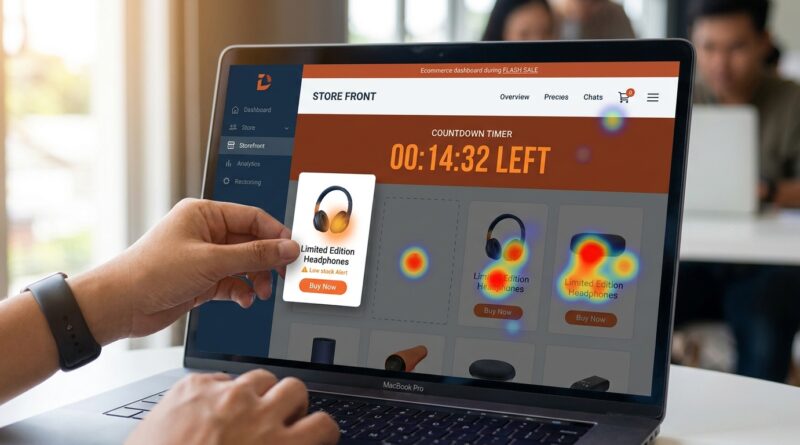
The only live metrics that really matter mid-sale
During a flash sale, you do not have time to stare at twenty dashboards. You need a short list.
1. Scroll depth
This tells you how far people are getting down the page. If most mobile shoppers never reach the discount block, product grid, or call-to-action, your layout is upside down.
2. Click heatmaps
Heatmaps show where visitors are tapping and clicking. If they keep poking at non-clickable images, tiny text, or decorative badges, your page is sending mixed signals.
3. Live conversion path
You want to know where people drop off between landing, clicking a product, adding to cart, and checking out. If the sale page gets attention but product clicks are weak, the page message is likely unclear. If product clicks are fine but add-to-cart is poor, the issue may be lower down the funnel.
4. Mobile versus desktop behavior
Never assume both are behaving the same way. During sales, mobile traffic is often larger and less patient. A layout that looks fine on desktop can be a mess on a phone.
The 15-minute playbook
Here is the practical part. If traffic is live and the page is underperforming, start here.
Minute 1 to 5: Find the biggest point of confusion
Open your live analytics, heatmap tool, and phone view of the page.
Ask these simple questions:
- Can I see the deal without scrolling?
- Is the main button obvious?
- Is the first screen doing too much?
- Are mobile shoppers dropping off faster than desktop shoppers?
Look for one clear problem, not five maybe-problems.
Minute 6 to 10: Make one of these three layout changes
Change 1. Fix the hero section
If the hero image is pretty but vague, replace it or crop it tighter. Your hero should do one job. It should explain the sale in two seconds.
Good hero section elements:
- A plain headline that says the offer clearly
- A short supporting line with urgency
- A visible button above the fold
- An image that shows the product, not generic lifestyle fluff
If your top banner says something like “Summer Starts Here,” that may sound nice, but it is not helping a rushed shopper. “Today only. 30% off best sellers” is much better.
Change 2. Move the offer block higher
Many sale pages hide the important part under a large image, a brand message, or a row of icons. If scroll data shows people are not reaching the actual deal, pull it up.
Move these items higher on the page:
- The discount details
- The end time
- The best-selling sale items or category links
- The first call-to-action button
People should not have to hunt for the reason they clicked your ad.
Change 3. Strip clutter from mobile
This is the fastest win for many stores. On mobile, every extra block steals attention.
Try removing or shrinking:
- Oversized headers
- Long intro copy
- Carousels
- Pop-ups that appear too quickly
- Extra badges and trust icons above the offer
The goal is simple. Get the shopper from landing to understanding to clicking with as few visual speed bumps as possible.
Minute 11 to 15: Watch for movement, not perfection
After one change, give it a little time. Watch whether scroll depth improves, product clicks rise, or bounce rate softens.
Do not expect a miracle in sixty seconds. You are looking for directional improvement. If the signal is positive, keep the change. If not, move to the next obvious fix.
What lightweight tools can help
You do not need enterprise software to do this well. Many small stores can get useful insights from tools they already have or low-cost add-ons.
Look for tools that show:
- Scroll depth by device
- Click heatmaps
- Session recordings
- Live funnel or path tracking
If you already use Shopify, WooCommerce, GA4, Microsoft Clarity, Hotjar, or similar tools, you may already have enough to start. The trick is not collecting more data. It is using the data quickly.
How to avoid making things worse
There is one trap here. Panic-editing.
When numbers look bad, it is tempting to change the headline, image, colors, buttons, countdown, and product order all at once. Then you have no idea what helped.
Keep your edits controlled.
- Change one major page element at a time
- Write down what changed and when
- Watch the same metrics after each update
- Do not touch pricing unless pricing is clearly the issue
This approach protects you from confusing noise with improvement.
A simple decision tree for live sale fixes
If you want something your team can actually follow, use this:
If bounce rate is high and scroll depth is low
Fix the first screen. Tighten the headline, simplify the hero, and move the discount up.
If scroll depth is decent but product clicks are weak
Your offer may be visible but not compelling. Make the value clearer. Feature best sellers sooner. Improve button wording.
If mobile underperforms desktop badly
Clean up the mobile layout first. Shorter copy. Smaller media. Faster path to products.
If people click everywhere except the main button
Your page hierarchy is muddy. Make the call-to-action stand out more and reduce visual distractions around it.
What a good mid-sale tweak looks like in practice
Let’s say your sale starts at noon. By 12:20, you notice mobile users are bouncing hard. Heatmaps show taps on the hero image, but few taps on the shop button. Scroll data shows many visitors never reach the discount explanation below.
A smart fix would be:
- Replace the vague hero with a sale-specific image
- Change the headline to clearly state the discount
- Move the timer and main shop button above the fold
- Reduce the top spacing on mobile
That is not glamorous. But it is exactly the kind of practical change that can rescue a campaign while it is still active.
Build a repeatable system for every future sale
The best part of this method is that it gets easier each time.
After each flash sale, keep a simple log:
- What layout was used at launch
- What the first weak signal was
- What changes were made
- What happened after each change
Very quickly, you will start seeing patterns. Maybe your audience always needs the discount higher. Maybe collections outperform product grids. Maybe mobile shoppers respond better to a shorter hero and a sticky button.
That turns each sale into a lesson, not just a verdict.
At a Glance: Comparison
| Feature/Aspect | Details | Verdict |
|---|---|---|
| Static sale page | Built before launch and left alone, even when live behavior shows friction | Easy to manage, but wastes expensive traffic |
| Live metric tracking | Uses scroll depth, heatmaps, and conversion paths to spot trouble during the sale | Best way to see where shoppers get stuck |
| Rapid layout tweaks | Small changes to hero messaging, offer placement, and mobile clutter in under 15 minutes | High value, low risk when done one step at a time |
Conclusion
Flash sale traffic is too expensive to waste on a page that stays frozen while shopper behavior is telling you exactly what is wrong. A smart real time flash sale page optimization strategy does not require a huge team or fancy tools. It just asks you to pay attention, move quickly, and fix the parts that block action. By borrowing a rapid-deployment mindset from fast-moving ecommerce teams and pairing it with lightweight tracking for scroll depth, click heatmaps, and live conversion paths, even small stores can improve results without touching pricing or ad spend. The real win is not just one better sale. It is building a habit. Watch the right signals, make three focused layout changes in under fifteen minutes, and let each campaign teach you something useful while it is still earning. That is how future flash sales get smarter, and more profitable, in real time.